Careful Curation Creates “Cross Pollination”
June 9, 2014
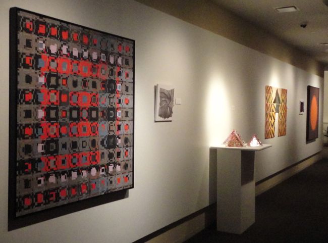 No obvious overlap links the work of artists (and SDA members) Patricia Malarcher and Larry Schulte, who recently had a 2-person show, Cross Pollination, at NYIT Gallery 61 (New York Institute of Technology, November 18, 2013 – January 15, 2014 in NYC).
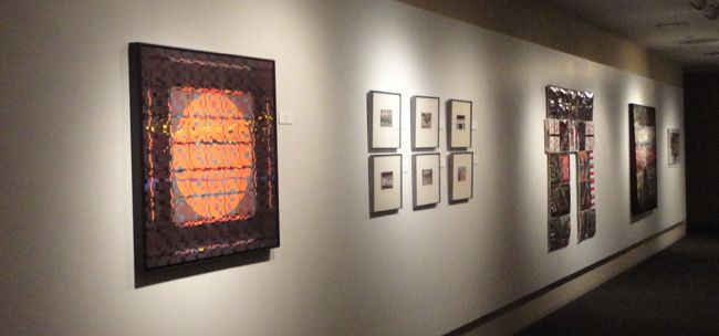
Yet curator Jennifer Mitchell-Nevin, who conceived the exhibition, selected the pieces and grouped them by parallel themes. She skillfully identified subtle, energetic correspondences of form, color, composition, technique, texture, or theme then installed the work to highlight these interactions.
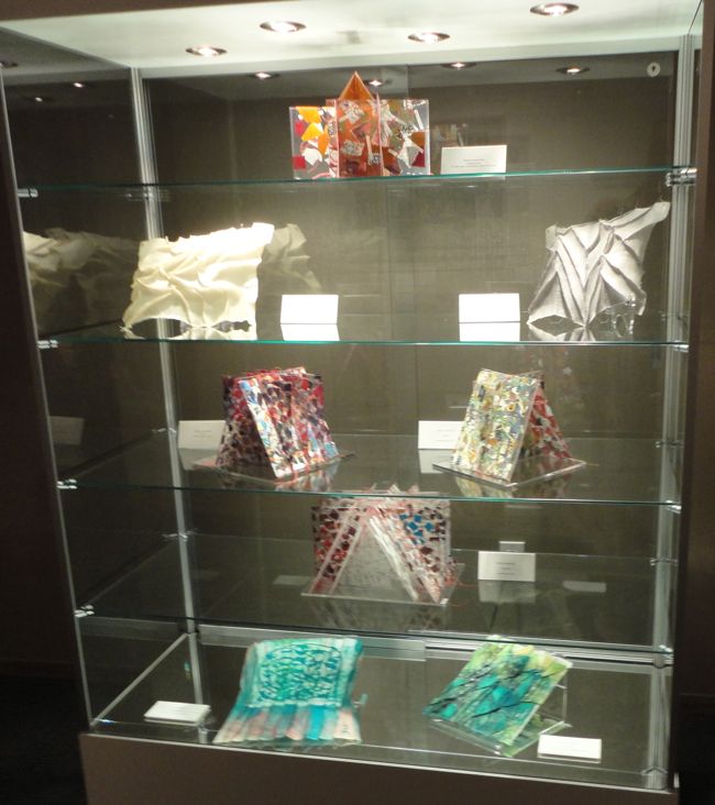 In talking about the show, each artist expressed surprise at a number of stages in its development. First was Mitchell-Nevin’s open-handed selection, which drew works from throughout each artist’s career – in contrast to most shows that concentrate on new work to the exclusion of the older. Both were pleased by Mitchell-Nevin’s thoughtful selections and pairings, commenting that the juxtapositions brought out new layers of meaning and effect.
More than “compare and contrast,” Mitchell-Nevin’s pairings had an expansive effect – rather like Joseph Albers’ theories about the interaction of color. He demonstrated that complex colors, placed side-by-side, could influence each other and exceed their individual boundaries. This effect is activated either by intoning in harmony or by counterpointing in simultaneous contrast. In this same way, Malarcher’s and Schulte’s work seemed to play together, releasing new and unexpected energy. Their interface seemed less a static Venn diagram of overlap than an alchemical mixing.
As a viewer, I was captivated by the charged interplays that Mitchell-Nevin set in motion. I followed her lead in a recent conversation with the artists about their processes and intentions which shaped the following observations about their work.
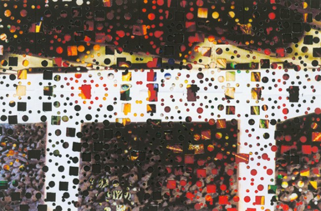
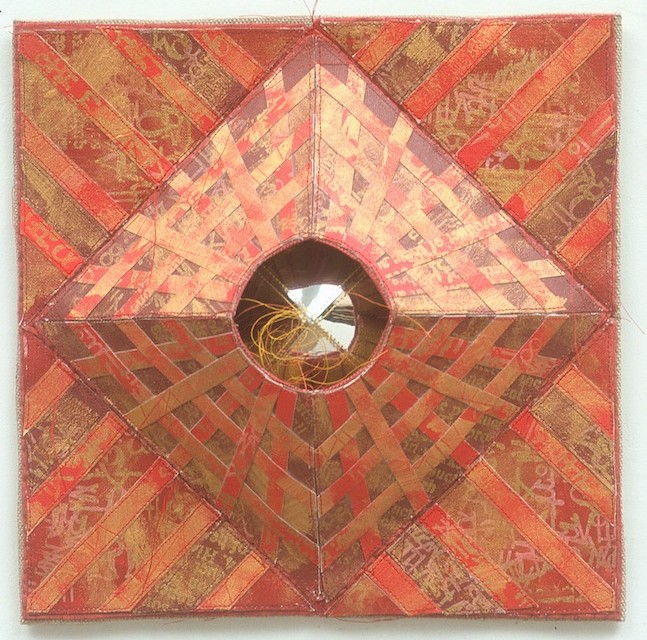
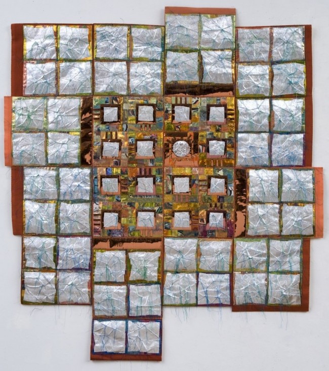
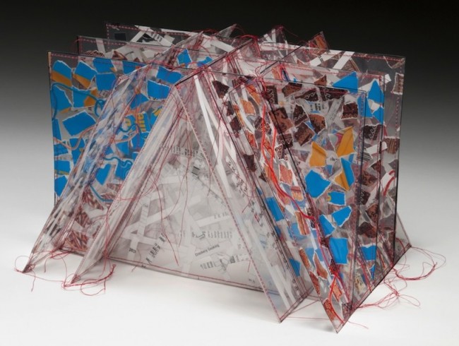
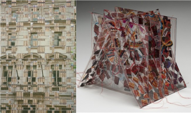
Though different in scale, the 2 images below share similarities of formal composition and layered construction. Malarcher works by addition, as in patchwork: piecing blocks, sewing them together, and then quilting the whole. Schulte works by subtraction, as in reverse appliqué: he pierces an image into lace by folding it up and punching holes in it like a paper snowflake. He then superimposes it over a colorful under-photo that peek-a-boos through the openings.
Both works bear a fine rectilinear network: Schulte’s, of creases; and Malarcher’s, of seams. This subtle grid plays against the bright notes in their palettes, suggesting contained festivity.
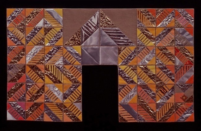
The genesis of these 2 pieces could not be more different. Schulte had been experimenting abstractly with layering, but his title, Bridge, also refers to the open ironwork structures of industrial bridges. Malarcher began with a Zen koan that she identifies with her creative process. It concerns a difficulty perceived in the future as a gate to be passed through; afterwards, one sometimes looks back to realize that the once-dreaded gate (or obstacle) never even existed. Just as in Schulte’s work, the viewer’s path of vision travels into the heart of the composition. Both also play with the notion of open architecture, whether of industrial lattices or “empty” arches, built to house a view.
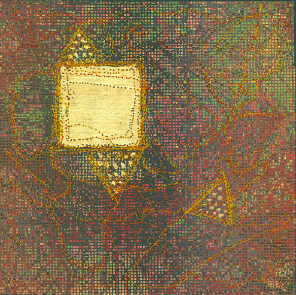
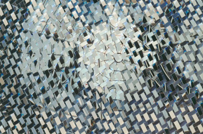
Both artists occasionally play with the sheen of metallic materials: Schulte with gold foil; Malarcher with Mylar sheets. In each, the material’s reflective shine contrasts to the dull glow of opaque surfaces. Both often enrich the neighboring surfaces with dense entanglements of thread, stitching and interlacement that seem to capture light like a thicket.
These shiny materials hint at transcendence. Schulte’s gold seems to rises off the surface of his “earthly plane,” while the background sinks behind it. Malarcher surrounds a glinting metal “eye” within a raised geometric cone – a bit like a 3-D twist on the mystic pyramid on the back of a dollar bill.
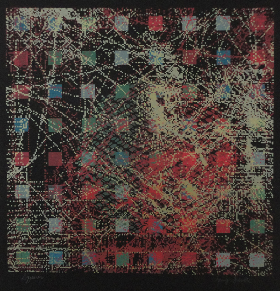
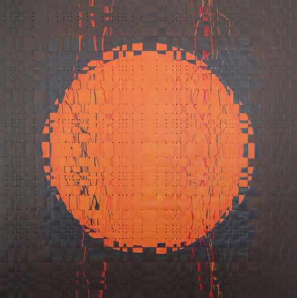
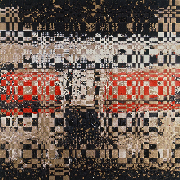
Schulte’s Squares has virtual layers, because although the work is single silkscreen, its sequential passes of ink cover and reveal under-images just as the stacked layers do in his punch-work photographs. Virtual threads are implied, too, by dotted trails that seem to sway across an abyss – like bedewed cobwebs in a mineshaft – marking receding levels of depth. Interestingly, his initial image was a contour map of the ocean floor.
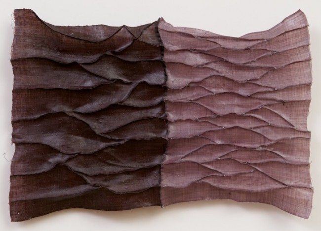
Malarcher’s, in contrast, beckons heaven: inspired by the gilded cloths surrounding saints in medieval Siennese paintings, its surface is also activated by hanging, gossamer-thin threads.
These 2 elemental images, evoking sun and earth, both have tactile surfaces that stimulate contemplation.
Schulte has sliced paintings into strips and rewoven them; Malarcher has sewn meandering ridges into hemp fabric, “stitch-shaping” gathers and folds (as in ancient methods of smocking cloth) and then dipped it in an encaustic wax medium. Both works emphasize the basic structure of plain weave with its simple but profound order of warp and weft.
This quartet of architecturally inspired pieces finds a connection between weaving and walls.
Fenestration means the opening-up of walls for doors and windows so a building can breathe. These openings transform walls from solid barrier into membrane, just like “tissue” (from Old French, “woven”) is composed both of “stuff” and “space” as crossing threads and their interstices.
Neither of these artists often works with overtly political themes, although the red, white, and blue banner-like striping of Schulte’s piece hints at patriotism.
Schulte himself feels that most of his work is based on landscape that evoke the strong horizontals of his Nebraska boyhood. Still, I can’t help but find a wonderful flag (in Homage, above) that hints broadly at American history (with nods to Jasper Johns, Warhol, and linsey-woolsey coverlets).
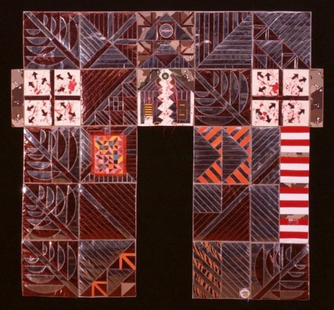
Passage is darker, figuratively and literally, as it laments the war in Iraq. Its grief-filled components include badges with ambiguously aggressive slogans, stripes that recall military service ranks, and medical bandage pads.
To conclude – as this brief analysis suggests – a curator’s skillful vision released visual Cross Pollination and charged interactions between the work in this wonderful show.
_______________________________________
 Lois Martin is an artist and writer living in Brooklyn, NY.
She frequently writes about art, with interests ranging from contemporary animation to archaeological textiles.
This is her 2nd story for SDA NewsBlog; her 1st was the tremendously popular story about Gail Martin’s (no relation) enduring gallery at www.surfacedesign.org/time-material-gail-martin-gallery-at-40

1 Comment
Brooks Luby says
August 14, 2014 at 8:38 pm
This looks like an absolutely stunning show. Brilliant work by the curator.
Related Blog Articles
Creative Process
“Fringe: On the Edge of Fiber” — Out Now!
Creative Process
Friday Fibers Roundup: Craft & Color
Creative Process
“Standing Tall: A Heart-FELT Reflection” by Martien van Zuilen