Inkodye + Me: A Love Affair With Transparency
July 1, 2015
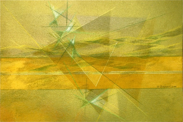 My fascination with the transparent nature of instrumental music – where the qualities of diverse instruments maintain their individual voice while working in harmony towards unity – led me to seek the same quality in the visual arts.
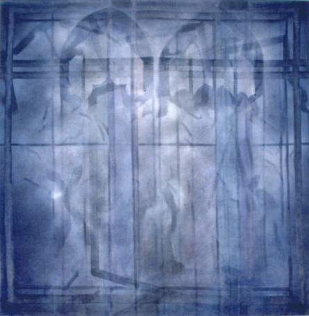 I am a self taught painter with academic degrees in musical composition and musicology. I realized during my university studies that I saw musical sounds and relationships on the same frequency as I heard them. For me, sound and sight were energetically connected.
After graduation, I moved to New York City to pursue an artistic career – though I wasn’t sure were or how I was going to express my artistic vision.
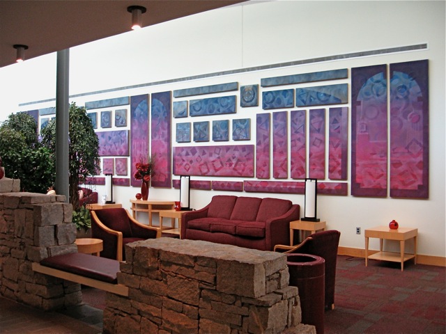
I began exploring the mixed-media/multi-layering approach to painting in my SoHo studio (1963-76) using diluted Koh-i-noor inks, Krylon spray paint and Berol color pencils on untreated cotton and linen canvas.
My initial encounter with Inkodye was in the early 1980s. I was intrigued by the brilliant color, easy application and safe nature of the dye.
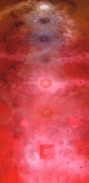 Inkodye is known as a vat dye, but one with the unusual characteristic of needing only direct exposure to sunlight’s ultra-violet rays to develop the color. Heat during the drying period fixes the dye permanently into the fiber. There are no additives, rinses, steaming or other fixative processes required to bond the dye permanently in the natural fiber!
Traditional art supply stores didn’t carry it. With some research and a referral, I got an introduction to the supplier, a screen printing company located in Oakland, California. Their phone was answered by a very friendly person with a heavy Asian accent, so I assumed this treasure came by boat from the Orient – though I later learned it was invented in the USA. Without asking for references, credit card information, social security number or any of the other security trappings of the world of modern commerce, they agreed to ship me a supply. I only had to promise them that, when I got it, I would send them a check! I was in love and it was 1982.
Inkodye was the first such product to come on the market in the early 1950s. Since the early 90s, several other art/dye products have been developed, each with differing results as to intensity, transparency and ease of use. For my purposes, Inkodye is the most versatile. It can be thinned with water, allowing the user to produce a broad range of tints and hues that can be mixed to create an even broader palette of transparent colors.
Painting and dyeing are very different processes!
With paint you stay on the surface of the fabric leaving its fundamental structure untouched. Dye changes the nature of the threads and penetrates to the core of the fabric. In each process, shapes & colors are used to express thought.
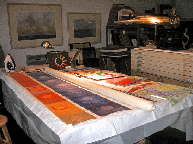 Painting a surfaces uses the fabric as a surface (any surface will do); dyeing couples with the fabric to lift both thought and material to a new expression. Not unlike the instrument through which the musician voices sound, fabric gives voice to dye. They are united in their search for soul.
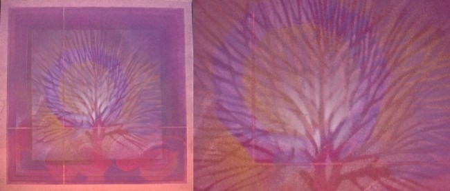
Along with that first shipment came an instruction and inventory sheet. Being short on change (a euphemism for being a starving artist) I was frugal in my application in my initial essays, only to be surprised that I could stretch the dye over large surfaces by diluting it with water. Of course as this thinned-out dye solution developed, it was much lighter in color. However, since I wanted to interlace multiple images at different layers, by using the same diluted solution numerous times (depending on the intensity I was seeking) I eventually arrived at the full strength of the vibrant color which carried along my visual thoughts – not just on the surface but penetrating deeply into the core of the fabric.
I was coming close to the complexity of the transparent symphonic sound!
One day in 2010 I received an encouraging message on my answering machine. Jesse Genet wanted to talk and “pick my brain” about Inkodye. She wanted to know about my experience with the dyes, whether I was still using them and get my opinion as to why they were not better known.
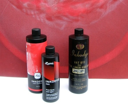 Of course I called her back to share the details of my many years of using them. I was thrilled to learn that she was taking over the company and going to continue to produce the dyes.
Enter Lumi – same intensity and consistency, but with a more narrow color spectrum – and new name. (Inkodye.com still exists to catch interest via the old brand name. – Ed.)
Yellows and greens are missing from the pallet. This will not be a problem until I have a commission asking for those colors. As a backup, I am trying the process of mixing other similar dye brands that have yellows and greens with Inkodyes. Some of these other brands are Pebeo, Spray it New & Dharma Trading Co. (which has its own brand).
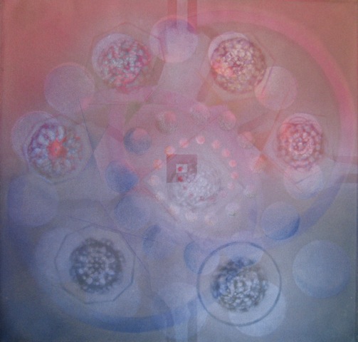 So far, no problem. Only time will tell what the long term results may be. I say this because I have commissioned works that have been exposed to daylight settings for 20+ years with no sign of fading.
Lumi.com website is easy to use with plenty of “how to” instructions. The site is geared towards first time users. With time, as the product gets better known, I’m sure this will shift toward a broader user audience. Lumi has graciously asked for and shown samples of how we independent artists use their product. They are also very supportive of workshops where Lumi dyes are used. I appreciate being included on their website.
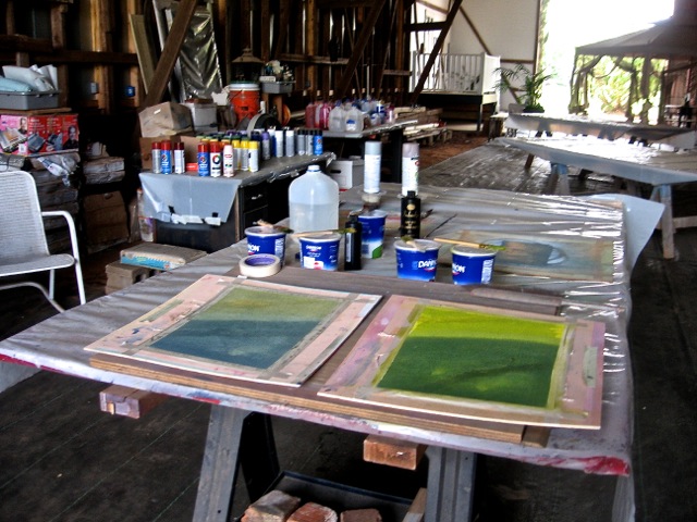
Since the early 90s, I’ve taught numerous workshops using Inkodye in my multi-media, multi-layering process – both here in the USA and abroad. Many of those participants have gone on to develop their own creative application of both the process and the materials. Independent ideas expressed through the medium renders the end product unique.
And, not unlike the instrument through which the individual musician’s transparent voice alters the aural environment, Inkodye/Lumi dye transparency alters the visual nature of the absorbent fiber and gives it a new voice.
(Editor’s Note: View a remarkable YouTube video of Jesse Genet’s pitch and negotiation with potential investors on ABC’s Shark Tank, below).
https://www.youtube.com/watch?v=5EW7mjADclg
______________________________________________
 Ray Pierotti is a practicing studio artist, composer, educator and curator (and SDA member!). Born in Utah, he has degrees from La Sorbonne and University of Utah. He began his professional career in New York City where he maintained a full time artist studio in SoHo while serving as curator and assistant to the director of Contemporary Craft Museum (now Museum of Arts & Design) and as director of national programming for American Craft Council.
He left NYC when invited to direct Arrowmont School of Arts and Crafts and appointed professor of design at University of Tennessee, Knoxville. He founded Sawtooth School of Visual Arts in North Carolina then moved to Georgia in the late 1980’s to revitalize Hambidge Center for Creative Arts & Sciences via the executive director role. He later served as director of Atlanta Museum of Design.
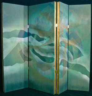 Pierotti leads workshops in his unusual textile and multi-layering, multi-medium painting process, curates exhibitions and serves on numerous arts council panels in the USA and abroad. In addition to maintaining his full time studio, he currently serves on the non-profit board of The Center for Arts & Rehabilitative Energies. He was a founding member of World Batik Council and Southeastern Fiber Arts Alliance. His most recent solo exhibition was at Albany Museum of Art. His current full time studio is located in Shellman, Georgia.
Visit his website at www.raypierotti.com
View his YouTube channel at www.youtube.com/user/raypierotti

9 Comments
Beverly Clower says
July 1, 2015 at 12:29 am
Good for you, Ray! This should contribute to your work and resume with a chain reaction! I love the textiles shown here - especially for their color - but the designs are splendid, too. And I recognize that I saw some of it in Shellman but did not know about the Inkodye.
Bunny Bowen says
July 3, 2015 at 6:11 pm
Ray, beautiful images and wonderful description of your creative process. This will be helpful to those considering using these dyes. Thanks for sharing so generously.
Franklyn Skidmore says
July 4, 2015 at 9:51 am
I've admired your work for so many years (but didn't know about Inkodye as your medium) so I'm sure that's particularly interesting to the "practical technician" - while I respond to your beautiful designs as a musician and art lover. What you achieve is always stunning.
Sylvia G. Berry says
July 4, 2015 at 11:15 am
What a beautiful way to start my day (July 4th)! Thanks for sharing your gift.
John Stuart Reid says
July 4, 2015 at 1:42 pm
Wonderful work, Ray! You are such a gifted and inspirational artist. Many congratulations on your beautiful Inkodye pieces!
Cyd Moore says
July 5, 2015 at 12:26 pm
Love your work, your mind and your heart, Ray. Thank you for so generously sharing the process behind your art (and music) You inspire me!
Jo Godfrey says
July 14, 2015 at 1:07 pm
Loved the images and color, Ray. Thanks for sharing this.
Liz Constable says
July 21, 2015 at 8:30 pm
What an inspiring connection between music and art! Beautiful work, and yes, what generosity to describe your process here!
Marianna Tubman says
November 2, 2015 at 12:53 pm
I just started using Inkodye this year, and have been using it with resist printing collages using found objects. One of the most fascinating things is the way that objects which are semitransparent create subtle images, as well as the overlap of shadows. Plastic, glass, fabric with holes in it such as lace, semi-transparent minerals, leaves and other plant material, all produce fascinating effects, and you can print one time with one set of objects and another time with other objects. The other interesting thing is that sometimes the image of a delicate object, such as a head of Queen Anne's lace, is clearer on the reverse of the fabric but somewhat washed out on the front.
Related Blog Articles
Creative Process
“Fringe: On the Edge of Fiber” — Out Now!
Creative Process
Friday Fibers Roundup: Craft & Color
Creative Process
“Standing Tall: A Heart-FELT Reflection” by Martien van Zuilen